Introduction
The environment in which employees work has a profound impact on their productivity and overall well-being. Yet for all the attention given to ergonomic furniture, smart lighting, and acoustic panels, colour remains one of the most underestimated levers in workplace design. This is where colour psychology plays a pivotal role. Colours can significantly influence emotions, perceptions, and daily interactions within a workspace, turning a mundane office into a vibrant, encouraging environment that fosters efficiency, creativity, and a genuine sense of belonging.
The relationship between colour and human behaviour is not merely anecdotal — it is grounded in decades of research across neuropsychology, environmental design, and organisational behaviour. For businesses investing in office fit-outs or commercial refurbishments, understanding this relationship is not a luxury; it is a strategic necessity. When approached with the precision that Building Information Modelling (BIM) affords, colour decisions become deliberate, data-informed, and demonstrably effective.
The Science Behind Colour Psychology
Colour psychology is the study of hues and how they influence human behaviour and emotional responses. The human brain processes colour faster than it processes text, and that initial sensory reaction shapes how employees feel within a space long before they are consciously aware of it. In workplace design, different colours can enhance mood, boost creativity, and reduce stress — or, when chosen carelessly, contribute to fatigue, anxiety, and disengagement.
Research from the University of Texas found that offices painted in white, beige, or grey were more likely to induce feelings of sadness and depression, particularly among employees. In contrast, workplaces with deliberate use of blue and green reported higher levels of focus and a greater sense of calm. Yellow, meanwhile, showed promise in environments where creative problem-solving was expected, though its application needs careful calibration to avoid overstimulation.
These findings carry practical weight. A 2019 study published in the journal Frontiers in Psychology demonstrated measurable improvements in cognitive performance when participants worked in rooms with a warm-toned accent wall compared to a neutral equivalent. The brain, it turns out, is highly sensitive to chromatic cues, and that sensitivity does not switch off when people sit down at their desks.
Utilising Colour in BIM and Interior Design
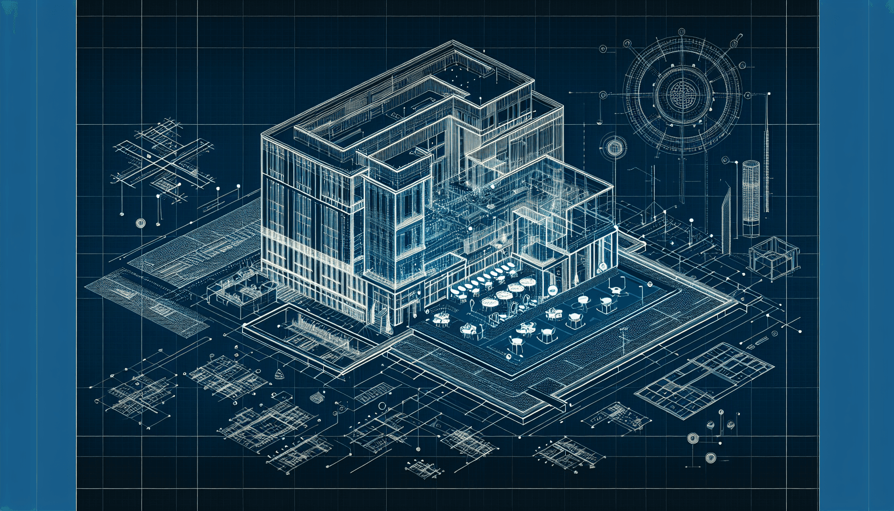
Building Information Modelling (BIM) offers a sophisticated platform that allows designers to experiment with different colour schemes virtually before a single tile is laid or a drop of paint applied. This capability enables designers to foresee the impact of their choices in real-world scenarios, accounting for factors such as natural light availability, room geometry, and material reflectance — variables that can dramatically alter how a colour reads in a finished space.
With BIM, designers can create photorealistic 3D visualisations that help stakeholders understand how the space will look and feel at different times of day and under varying lighting conditions. This ensures that the chosen palette aligns with the intended emotional and psychological objectives rather than simply looking attractive in a swatch book. Clash detection and space simulation tools within BIM environments also allow teams to model how colour interacts with furniture layouts and material finishes, producing a holistic view of the completed interior.
For example, our team at Adyantrix recently collaborated with a technology company during a significant office expansion, deploying a palette of blues and greens — colours scientifically proven to promote a sense of calm and enhance concentration — throughout their development offices. Using BIM, we highlighted how these subtle hues would interact with the building's generous glazing, demonstrating to the client how the tones would shift from cool and focused during morning hours to warmer and more restful as the afternoon light softened. The result was an environment that demonstrated a measurable boost in both morale and output, with employee satisfaction scores rising noticeably in the quarter following the fit-out.
Practical Application of Colour Psychology
Blue: The Productive Powerhouse
Incorporating blue into the workspace has been shown to stimulate the mind and increase task productivity. Associated with clarity, trust, and intellectual rigour, blue is an ideal choice for workplaces that rely heavily on analysis, data, or sustained concentration — finance firms, software development studios, legal practices, and research organisations all benefit from its stabilising presence. Deeper navy tones communicate authority and reliability, making them well suited to client-facing reception areas or boardrooms. Lighter cerulean and sky blues, meanwhile, are better placed in open-plan working areas where prolonged desk work demands a calming backdrop.
Green: Breathing Balance
Green inspires a sense of balance and calm, drawing on its association with nature to reduce anxiety and promote harmony within the workspace. This quality makes it especially valuable in high-pressure industries such as healthcare, legal services, or financial advisory, where the mental well-being of employees is directly tied to professional performance. Biophilic design — the practice of incorporating natural elements into the built environment — frequently uses green as a bridge between living plant installations and the surrounding architecture, creating spaces that feel restorative rather than simply functional.
Sage and muted olive tones have become particularly popular in hybrid workplaces, where employees returning from remote work expect interiors that feel less institutional and more considered. These softer greens encourage a sense of belonging without demanding attention, which is precisely what a returning workforce needs.
Yellow: Catalyst for Creativity
Yellow, the colour of optimism and energy, is well suited to creative spaces such as marketing agencies, innovation hubs, design studios, and client experience centres. It encourages enthusiasm and spontaneity, pushing employees to think laterally without the anxiety that more intense or corporate environments can induce. However, yellow requires disciplined application. Large expanses of saturated yellow can become fatiguing over time, so it is most effective as an accent — a feature wall in a brainstorming room, the interior of a breakout booth, or a series of pendant light fittings above a collaborative work surface.
Red: The Energiser
Red can invigorate a space and its occupants, bringing a sense of energy, urgency, and physical alertness. It raises the heart rate slightly and heightens sensory awareness, which makes it useful in contexts that benefit from short bursts of high engagement. However, prolonged exposure to red in a primary working environment has been linked to elevated stress and decreased accuracy on detail-oriented tasks. Strategic use in areas designed for physical activity, active collaboration, or transitional spaces — such as corridor installations in fitness and wellness facilities or interactive public areas in visitor centres — can be highly effective without the drawbacks that come from overexposure.
Colour Zoning: Designing for Different Work Modes
One of the most sophisticated applications of colour psychology in contemporary workplace design is the practice of colour zoning — the deliberate assignment of different hues to different functional areas within the same office to support distinct modes of work. A modern workplace is no longer a single-purpose environment; it accommodates focused individual work, collaborative team sessions, informal social interaction, and private restorative retreats, often all within the same floor plate.
Colour zoning makes these transitions intuitive. Deep blue or forest green signals to employees entering a focused work zone that this is a space for concentration. A corridor transition to a warmer terracotta or amber nudges behaviour towards social interaction and informal exchange before employees reach a collaborative zone. Pale, neutral tones in wellness or quiet rooms communicate a deliberate shift away from stimulation and towards restoration.
This approach requires careful coordination between interior designers, space planners, and workplace strategists. BIM facilitates this coordination by providing a single, shared model in which colour, lighting, material, and spatial data are integrated. Design teams can test multiple zoning configurations against each other, evaluate their visual coherence, and ensure that wayfinding logic is clear without the need for signage to compensate for an incoherent colour strategy.
The Role of Lighting in Colour Perception
No discussion of colour psychology in workplace design is complete without addressing light. Colour does not exist in isolation — it is perceived entirely through the interaction of a surface and the light that falls upon it. The same paint colour can read as vibrant and uplifting under cool, daylight-balanced LED fixtures and as dull and grey under warm incandescent equivalents. East-facing rooms that receive morning sun create a different chromatic experience from north-facing spaces with consistent but flat indirect light.
BIM's ability to simulate solar gain and artificial lighting schemes at different times of day is invaluable here. Designers working within a BIM environment can model how a chosen palette will perform across a full working day and through different seasons, identifying potential problems — a yellow that washes out in the low winter sun, a blue that becomes oppressively cold on overcast afternoons — before they become expensive on-site corrections.
Lighting also interacts with material selection. A matte paint finish diffuses light and softens a colour, lending it subtlety. A satin or semi-gloss finish will intensify the same hue, increasing its visual presence and psychological weight. BIM material libraries allow designers to test these permutations systematically, ensuring that the specified colour achieves its intended psychological effect regardless of the surface it occupies.
Incorporating BIM for Strategic Colour Implementation
BIM is a transformative tool in blending architectural insight with design ambition. Beyond simply visualising, BIM allows designers to simulate not just colour but lighting changes over time, providing a dynamic, living interaction with the environment that static mood boards cannot replicate. By utilising BIM tools such as Revit plugins and add-ins, design teams can iterate quickly and accurately, producing multiple scheme options for client review without the delays and material costs that traditional sample and mock-up processes incur.
BIM also supports the documentation of colour specifications with a level of detail that reduces the risk of costly errors during construction. Colour codes, material references, surface finishes, and application zones can all be recorded within the model and linked to the procurement schedule, ensuring that the design intent survives the transition from drawing to built reality. For large commercial projects involving multiple floors, multiple tenants, or phased delivery, this coordination capability is not simply convenient — it is essential.
Furthermore, post-occupancy evaluation data collected from completed BIM-informed projects can be used to refine future colour strategies. When organisations commission Adyantrix to deliver BIM consulting or interior design support, they gain access to a growing body of real-world evidence about how specific palettes have performed in analogous environments, enabling genuinely evidence-based colour decisions rather than ones driven purely by aesthetic preference.
Conclusion
The thoughtful application of colour psychology in workplace design, supported by advanced BIM methodologies, can fundamentally transform how spaces are perceived and how effectively they support the people within them. Colour is not decoration — it is an active participant in shaping behaviour, regulating mood, and communicating organisational values. In the current commercial landscape, where talent retention, employee well-being, and workplace experience are genuine business priorities, the strategic use of colour in the built environment deserves the same rigour as any other design discipline.
At Adyantrix, we integrate colour psychology principles directly into our BIM consulting and architectural design workflows. Our teams use BIM not simply as a visualisation tool but as a decision-support platform — one that allows us to model, test, and refine colour strategies in relation to light, material, space, and human experience. Whether you are planning a new office fit-out, a commercial refurbishment, or a large-scale development, our expertise in BIM-driven interior design ensures that colour choices are deliberate, evidence-informed, and aligned with the well-being and productivity of the people who will inhabit the space.
A well-designed workspace is more than a static backdrop to daily work — it is a dynamic environment that actively supports the people within it. Colour, when chosen and deployed with precision, is one of the most powerful tools available to achieve that outcome.
Speak with our BIM Consulting team at Adyantrix to find out how we can support your next project.